Monday, October 4, 2010

GCA Drawing Competition Awards Reception

Drawing Competition Awards Reception

Here are some photos from the reception on Friday night. I'm still waiting to receive photos of the drawings themselves, so keep checking back! I will post them as soon as possible. Meanwhile, American Painting Video Magazine posted a little video of the reception on their facebook page that briefly shows the winning drawings, so check it out.

The Judges: Michael Klein, Edward Minoff, and Scott Waddell

Edward Minoff shakes the hand of first place winner Darren Kingsley

the crowd goes wild!

The Winning Drawings

Here are the winners!
Drawing skills are the bedrock of good painting, and the foundation on which form and color can most truthfully be expressed. It is incumbent on the artist to routinely sharpen and develop these skills from life. The intent of this competition is to bring greater prestige and honor to those artists who have devoted time and energy to honing these abilities. It will be a pure test of drawing skills.
The draftsman who executes the most beautiful drawing will be awarded the Grand Prize accompanied by the title, Apelles. The second place prize includes the title, Protogenes. The winning draftsmen will hold these titles until the next annual competition.

by Darren Kingsley: Grand Prize, Apelles

by Will St. John: Second Prize, Protogenes

by Carla Crawford: Honorable Mention

Viewing the drawings at the awards reception


Camie "life of the party" Davis, we love you!

The Giust Gallery

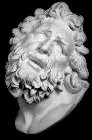
I recently took a visit to The Giust Gallery in Woburn, MA. This Place is a real gem and I can't believe I hadn't heard of it sooner considering that I am from Massachusetts. I stumbled upon it on-line while looking for plaster cast to buy for my own studio. When I arrived I was greeted warmly and taken on a tour of there studio. I was amazed at the bulk of there collection. One could tell that The Giust Gallery really took pride in the work. They took time with me to thoroughly explain each step of  there working practices. Later they described a little about there history in the States and how they came to acquire all of these wonderful molds.

"The quality of a reproduction is of the greatest importance. In an original work of merit there is a subtleness of treatment- a certain feeling which, if captured in reproduction, places the finished piece within the realm of art itself."

- Pietro Caproni, 1911
Florentine master craftsman Pietro Caproni practiced the art of creating quality reproductions. During the last two decades of the 19th century, he traveled through Europe making molds directly from masterpieces in museums such as the Louvre, the National Museum in Athens, the Vatican, the Uffizi Gallery, and the British Museum. Considered the greatest craftsman of his time, Caproni was one of the last to be allowed the freedom of casting directly from museum pieces.
In 1900 Pietro Caproni constructed the Caproni Gallery building, at 1920 Washington Street in Boston, to cast and house his reproductions. He made them available to museums, schools, and private connoisseurs through an illustrated catalogue which listed over 2500 casts, including such extraordinary pieces as the full-size Winged Victory of Samothrace and Michelangelo's head of David. The Caproni Gallery became the leading art gallery of its kind in the world.

The Water Falls

The Water Falls finished painting
The Water Falls is an example of my work that is partly conceptual with references of nature. My main concern was to create  some sense of movement. I did not want to limit that movement to just the rush and thrashing of the water but a movement that drifted with the mist into the atmosphere of the background. The running water posed a problem to paint in the fact that it just doesn't stay still long enough. I also tried to take a few photographs to see if that would solve the problem which only made for poor results. All of the photos I took made for a very still and dead feeling. Using my imagination I tried to make a base of non-repetitive natural shapes to run through the whole painting. All of these shapes more or less going into the same direction over the edge of the cascade. It was also important for me to make the reflective parts of the water interesting. I knew I needed to have these little mirrors in the water to be influenced by there surroundings. With this in mind and the idea that as thing recede they may also become cooler ( lower in chroma ) came to mind. To solve that problem I was able to place a cooler green color in the back reflected from the background trees. I then placed a higher chroma color in the foreground to catch the eye and hopefully pop it forward. I am aware now in writing this that there are many schools of thought in making objects advance and recede by attention to edge, tone ect. At last I am not stating that there are better ways to paint. I am just describing my approach to this particular painting.


The Water Falls pre-sketch in pencil

Here is a preliminary sketch to get my bearings on the composition and tonal relationships. This drawing was made three times smaller then the finished painting. Working in this manner I am able to get an idea of how things are working together. At this stage I will know to improve on the idea or scrap it completely.


The Water Falls oil sketch

The oil sketch or poster study works similarly to the pencil drawing. Because I was able to establish in a general way the composition and tones in the previous stage I am now able to embellish them more in color. Again this is a small painting, the same size as the preliminary drawing. For me this cuts out a lot of guess work in the finished painting. All of my experiments can be done here without fear. These studies are best done from life then taken back to the studio for referencing throughout the entire painting process.


The Water Falls finished painting

Lastly we have the finished product. Here you can see minor changes in both color and tones from the oil sketch. In the oil sketch I left the upper right hand corner lighter in tone. As the painting progressed on a larger scale my eyes seemed to exit the corner every time I looked at it. To remedy this I decided to apply a sort of vignette to the corners to hold one's eyes in the painting a bit longer. There is much more a level of finish and detail added to the finished painting. Also in the lighter foreground area I added much impasto to emphasize the frothiness of the crashing water. I imagine with a coat of varnish and the gallery lights it will sparkle like a gem furthering the sense of movement.

Thursday, June 17, 2010

Master Copy Challenge by Brian MacNeil


Master copies have always been a joy for me. I feel I am really able to learn the language of oil painting by trying to reproduces these amazing works. With each painting I witness may vocabulary broadening with new understanding of how the materials flow. Another benefit I've found with Master Copies is a new sense of design. The painters of the past, well at least the painters I look up to seem to portray there subjects with more style and vigor. For example the elegance of many Van Dyke's portraits is experienced by the elongation of the body, more commonly noticed in the neck and hands he paints. On the other hand the artist Rembrandt designed many of his figures quit stubby and round. In Rembrandt and his many self-portraits the drawing of one is often rather different from an other. The beautiful and amazing thing is that no matter which portrait you are looking at you know it is him. Rembrandt has a way of presenting an intimate scene were we relate and feel apart of. I once heard a story about Annigoni where a lot of his portraits didn't look much like the sitter. The point wasn't so much to get a photo realistic image of the persons but there essence. The part of the person that is felt and not seem by eyes. A sentiment that one feels like a memory or a dream. I believe that is why so many flocked to have there portraits done by Annigoni. They wanted to be transformed into something deeper then the way they looked.
So the importance of Master Copies is that they provide you with information that painting from life cannot. There are tricks and techniques that are not always visible in nature so one can either get real creative or look back to the masters to help us tell our stories. They teach us how to paint lips, what edges to blur, and open our eyes to see what colors are used to make a white drapery.
The Cornelis Van Der Geest has been one of my favorites since I first laid eyes on it. Even today it still gives me goose bumps looking into the gaze of it's eyes. Every time that I am in London I go straight to the National Gallery to see it like i'm visiting an old friend. I never get tired of it. It becomes a new painting every time I study it. Often it makes me want to give up painting all together when I think about the fact that at the age of 19 Van Dyke painted this marvelous and sophisticated head.
First off i made a pencil drawing to place all the features to get familiar with the shapes and tonal relationships. I find it useful to make this drawing first because the whole time that I am drawing I am imaging my plan of attack. It may seem like an extra step but in my experience it saves me time in the long run. By the time I have brush in hand I have already painted it several times in my head working out all the kinks.
basic block-in
pencil drawing heightened with chalk

After I have transferred the drawing to canvas I use Raw Umber and Lead White to tone and lighten the drawing. I am in a way making a map for my self to follow later on with color. In this study this is the last time I will use Raw Umber.
The underpainting

I left the painting to dry over night and to be economical with time I started in at the lower portion of the head letting the opaque passages of white dry a little bit longer. The colors I have chosen are limited to just Lead White, Yellow Ocher, Burnt Siena and Ivory Black. Also I am using a Sun-Thicken linseed oil medium that I have been told was used by both Rubens and Van Dyke.
First placements of color

In this stage of the painting I have a majority of the colors and tones placed. I'll spend the next day or so fixing the drawing and adjusting the tones and colors. I am very careful no to work too add much color to the forehead at this point. I have keyed the values lighter there with some heavy impastos. I did this because I wanted the the forehead to be of lighter value and higher chroma. To get that affect I will carefully make thin semi-opaque passes over the forehead. Modeling the forms just enough not to end up mud.
Color and tones

More correcting and modeling of small forms. The fancy brush stokes I leave out until I am confident enough that the drawing, hues and tones are relatively in the right places.
smaller forms being modeled
Now with all the guess work behind me I decided to repaint the entire head all over again. I wanted all of the strokes of paint to be painted into the one beside it. Also I was noticing that the flesh was looking a little dull and grey. I tend to like broken color and cooler flesh tones in paintings but this to me as it was lacking uniformity and life. I repainted the head and half the collar in a day. I haven't touched it since because other paintings are taking up my time. 
The unfinished end result
Thank you very much for viewing this work. You may check out the Pushing Pigments Blog to see other artist take on this same task.

Thursday, June 3, 2010

Pushing Pigmentes Portrait Challenge


Portrait of Jesse Paz
My prep drawing for Jesse's portrait in pencil

Hey all, this is my portrait of Jesse Paz another artist in the Pushing Pigments project with me. You can also see the portrait he did of me if you visit our blog.
I basically started this painting how i would any other painting lately, with a rough drawing. I find the proportions, contours and shadow shapes and that is enough for me to work off of.
From this point i made an oil transfer with Raw umber and loosely established the shadow patterns. You can find examples of the oil transfer on Douglas Flynt's blog.
Oil sketch of Jesse Paz in Raw Umber

I then chose to start painting from the darkest part of the shadow on the neck. My goal was to paint everything in one pass and not to worry about all the little detail. What is more important to me is developing the form and not letting the drawing get away from me. I also restrict my palette to some basic earth colors such as Raw Siena, Burnt Siena, Ivory Black and Lead White. It is not until i get into the lighter areas of the flesh were i'll switch from Raw Siena to Yellow Ocher.
First painting stage

Now that i have all the basic colors and forms figured out I can go over them and check for mistakes. More so than the color and tones I am worried about the drawing mistakes. In the end it doesn't matter as much what color things are or how expressive the brush work is. I often change to some degree the colors or tones to fit the mood of the piece that i'm going for. If the drawing isn't correct or at least having the shapes work well with each other one may have just an exciting portrait of Quasimodo.
The color, tones and forms blocked in

After I have corrected all the major drawing mistakes I made in the process of adding the color I now have a good base to finish the portrait. This time I work in the halftone and light areas first. I pick one section at a time and take it to a finish leaving the shadow shapes to the very end. The highlights on the cheek, nose and forehead were the finishing touches on this piece. I worked about three days on this portrait one day on the drawing and two to paint it.
Finished Portrait sketch of Jesse Paz

Wednesday, May 12, 2010

The Oil painter’s palette


my wooden palette with my choice of oil colors


The oil painters palette is one of those things that seem like magic for the student painter. Choosing the right colors, arranging them just the right way and then changing them all over again, again and again. At least this is my story. I can remember first starting out painting the concept of mixing colors together to produce other colors really didn’t enter my mind. I found myself at the art stores buying all these different hues planning to one day paint with them.
To my surprise later on in years I discovered that one doesn’t need every color the supplier can produce to make a wonderful painting. In fact one can get along pretty well with just a red, blue, yellow and the addition of white. With that in mind that is how i have set up my own palette. From left to right i have Lead White, Cad. Yellow medium, Yellow Ocher, Raw Siena, an earth red ( I have been jumping back and forth from Red Ocher and Burnt Siena), Cad. Orange, Vermilion or Cad Red Light, Alizarin Crimson, Raw Umber, Cobalt Blue, Ultramarine Blue and Ivory Black. Now this may seem like a lot of different colors but in my mind i still only have white, red, blue, yellow and a short cut color named orange (I have the Cad. Orange because i was not able to reach the same high croma mixing red and yellow together). All of these colors on my palette have something in common. They start out at a lighter high chroma value and then fall to a darker low chroma value. When I am trying to match a color I ask myself,”what kind of red, blue or yellow is that.” My next question would be, ” what is the general value of that color.” Lastly I would then check the chroma of my mixture. If i have matched the correct hue and value there should be very little fiddling around with chroma.
One could argue and say that this system is too simple and i may agree with them. But for me I like to think of the colors on my palette in there most direct form. For example when I’m painting flesh or objects in nature it is very rare that i’ll need to dip into my cadmium colors. In fact this is the way in which I prefer to start a painting. There are two reason I limit myself in the beginning and paint only with the earth colors. One is because I am not an alla prima painter, my work consists of several layers of paint to get the look I’m going for. So with the earth colors I am able to apply a faster drying paint layer without the use of a rapid drying medium that may weaken the paint layer. The second reason is that I feel by in the beginning working in a limited manner I’ll have more choices to work with when I come to finish the painting. Say if I need one object to stand out among the others, I can boost up the chroma merely by the addition of a little cadmium color. Generally I reserve the cadmium colors for the lighter value color mixtures. When my mixtures are primarily comprised of white I prefer using the cadmiums to combat there chalkiness.
Of coarse there are many exceptions to the rules when mixing color. I only offer just a brief description of what goes through my head while I’m making a painting. My hopes is that this can help simplify the subject just enough to make your painting easier. I also wish for others who are more experienced to comment on this section in a helpful giving spirit to advance the education of art to whom ever reads this blog. Thank You!

Pushing Pigments


PUSHING PIGMENTS


Hey everyone, there is a brand new project that myself and a few friends are co-founders of call Pushing Pigments. It is a monthly revolving format in which one artist per month picks a project that all other artist will follow and record their processes. The artist include myself,Jonathan Aller, Mark Cummings and Jesse Paz. This months project is portrait painting. Between the four of use I will be painting Jesse, Jesse painting me. Jonathan painting Mark and vice versa. So come take a peak at our work and leave a comment.pushingpigments.blogspot.com