Monday, January 31, 2011

Justice


Hey all!!! Here is a painting I just finished a little while ago.  My friend Tristen was kind enough to pose for me. I'm sorry For the poor quality photos in this post. I wasn't really planning to document this painting. I just took a couple shot here and there with my Iphone. I think that you are able to get the picture of the different stages it took to make this portrait.


I initially started this portrait as a sketch and had no intention of bringing it any further. I just wanted an excuse to play with charcoal.

I later decide maybe I'll do a color study and play with some backlighting.

So by the time I got to this point I said to myself I might as well finish the painting.

I enjoyed making this painting. I started it in a carefree way not worried about the outcome. For me it was a nice break from the gallery work I usually do.  I didn't agonize over if the drawing was correct, if the colors were perfect or not. It just reminded me to have fun with my work and continue to grow.

Tea for One Oil Painting Demo

Thanks everyone for visiting. This time around in painting I wanted to tackle some different textures. I wanted to paint this unique tea pot that I acquired while in high school. I always loved the patina like glaze and the handmade feel of its form. Throughout most of all of my still life's there has been signs of age, cracks and decay. I've never really been drawn to ultra smooth or perfect scenes. I feel there is so much more character in distressed items. In my opinion the story will pretty much tell itself when you come across and portray those one of a kind objects.

Here is my basic set-up for the still life. I almost always work with the set-up directly beside my working surface to get a one to one comparison. When working on still life I find if most useful to work in this manor.


In starting this painting I quickly sketched out all the major forms on paper with pencil. In this stage of the process is where I decide the size and placements of the final composition. For this piece I chose to go with 12 X 10 inches.


The next stage was to transfer the drawing to the linen. I used a fine weave oil primed linen on panel that I bought from New Tradition. I believe it was L600.

Notice the dark band across the top of the linen is caused by my easel casting a shadow. I would normally adjust that right away but in this case because it didn't block the main subject I decided to be lazy and let it be.


In the Raw Umber wash stage I try to find the tonal relationships between the objects. I work in a general way compressing values making simple flat tones. I'm not interested in details or turning forms at this point. All of the little nuances will come with time in the later stages of the painting. In the back of my mind I'm starting to construct a base and narrow down my decision making for the later layers of paint.

For the first time of applying color I look for an approximate middle tone for the areas receiving light leaving the shadows in the Raw Umber stage. I can later decide to lighten or darken the middle tone to conceptually turn the form of the objects.

Now that I have covered the entire linen with a tone and their approximate hues I can start using it as a map to guide me in finishing the painting piece by piece. One could definitely skip this stage by making color or poster studies ahead of time. I often make color studies for more complex paintings.

Carefully I repaint everything I've worked on up until this point. My choices are made deliberately and wisely trying to bring each part to its finish. I have slowed down quite a bit compared to the rapid pace in which I started the painting.

I finally arrived at the finished product after much fiddling around. One thing I tried to do in the final paint layer was to bring some color unity into the piece as a whole. Therefore I made sure to introduce broken applications of blue into the tea pot, cup, stone and wood table top. I basically matched the value of the blue to the object I painted into to have a more subtle amalgamation.

Thank you again for visiting.

Monday, January 24, 2011

The Angel Academy of Art's Academic Process Videos

Hi all!!! My old school in Florence, Italy The Angel Academy of Art just sent me these great videos on the school and it's working process. The videos were shot very well and it made me home sick to go back and study there. It's been four years since I graduated and been in a class room environment. I miss the friendly competition and the sharing of technique and ideas. Looking back I realize how much I really learned at the Angel Academy. Being a professional tattoo artist for over fourteen years I thought I knew a thing or two about art and drawing. After studying at Angel under Michael John Angel, Jered Wiznicki, and Martinho Isidro Correia I found out that under there shadow I had a lot to learn. The three instructors basically built me up from scratch and taught me an invaluable discipline that I'm still trying to perfect. 

So these videos are the first two of three that give a brief overview of the deep academic process of the Angel Academy of Art. I either could not find the third video or it is just not finished. If anyone is Planning to study in this tradition and has the monetary means I would definitely consider checking out Angel.

I look forward to seeing the third video and when I do I'll make sure to update this post. 


Wednesday, December 29, 2010

Contemporary Masters Show


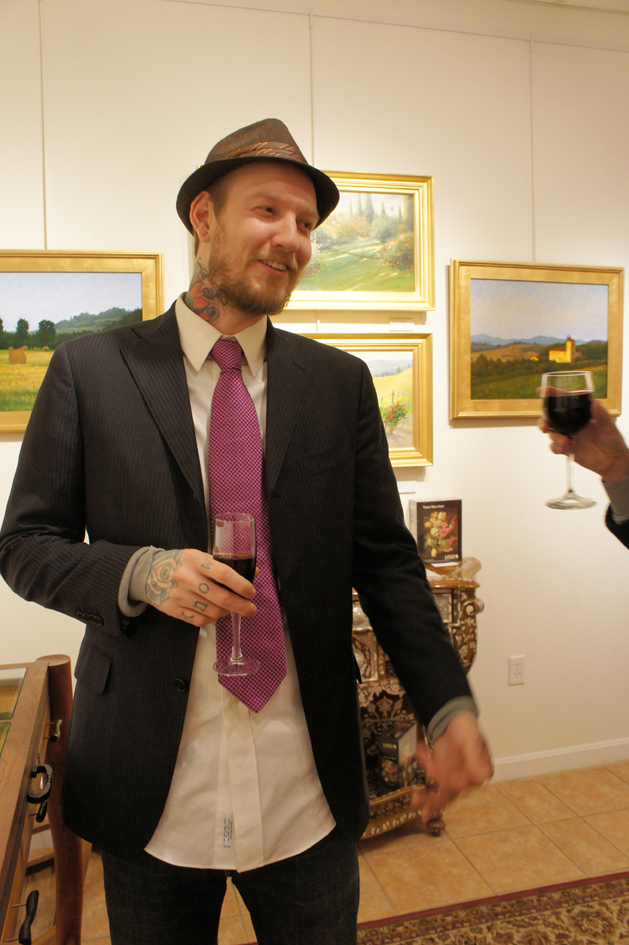
Hello All!!! I wanted to share photos of opening night at the Royal Gallery last December 9th. It was a wonderful night of friends, laughs and art. I was pleased with the turn out and also the many new faces that visited the gallery. For the first time I was able meet the other artist that are represented by the gallery. Over all It was a great time and experience sharing our art with Rhode Island.


Sunday, December 19, 2010

The Skull Demo

The Specimen


Hey Everyone, I wanted to take this time to post another painting demo base on how I paint red fabric. Countless times people asked how I did it, what colors that I used and what was my painting process. Well to start this is a technique that I learned while studying still life painting at The Angel Academy of Art in Florence, Italy. After cast painting learning to render red cloth was our first task to tackle in still life.
The idea behind painting red is having a wide range of value  maintaining a high chroma throughout. That being said how does one lighten red without changing it to pink or orange? Any addition of white will not only make pink but lower the chroma. Orange can work well to lighten red only a couple of values while maintaining its chroma but not 100% convincing. The way in which I was taught was a type of glazing technique. In the nature of glazing, applying a thin and darker value over a light ground will with most colors retain and heighten it's chroma. So in this demo I will be using the lightest value ground I can think of, the white of the oil primed linen. The majority of the glazing will be done with transparent and semi-transparent reds.

sight-size set up


I started the drawing for this still life using the sight-size method. I find it the easiest way to check my proportions, angles and form relationships. I can simply flick my eyes back and forth to check for drawing errors and then change them just as fast as they are noticed. Instead of drawing with oil paint directly on the linen I opted to start  by using pencil on paper. I find I have more control over the composition of the painting before I transfer it onto the linen. Starting in this way is also beneficial in this painting in order to maintain the white of the ground. Any stain or residue of color on the white ground will detract from the luminosity of the future red glazes.

The skull transferred to linen


After I have transferred the finished drawing onto linen I can then start the underpainting. I carefully wash raw umber into the background and skull being mindful no to contaminate any of the areas that will be red.

The Raw Umber wash drawing.


When the Raw Umber wash was dried I toned the background and shadows with Ivory Black.

Wash drawing toned with black.


The next stage is what they called the first painting stage at the Angel Academy. This is the stage where all of my first guesses are made in establishing all the other colors and tones. This is the first time that I visit the red cloth area. I used Scarlet Red from Winsor and Newton for the first layer in rendering the cloth. I don't use any medium to apply the red, I just scrub it in with a bristle brush. The important thing to keep in mind is to apply leave a thin even layer.

First Painting Stage


I continue to rework the skull and background elements trying to resolve drawing errors. Because I was able to state in a general way the the colors and tones I'll be using I can start to render and bring to a finish the small forms. At this time I'd like to finish as much as I can to let the red I just applied to dry thoroughly. Each layer must be dry so that older layers do not lift.

Refinements of first-painting.


I used Cad. Red lt.,Cad Red med. and Alizarin Crimson to scrub over the dry bright red base. I started with Cad Red lt. first working from light to dark. My brush was almost dry so that I could incrementally darken the cloth with the most control and not over work any of the areas. For every darker value red I added I had to let the previous layer dry. The shadow areas of the red I used a Persian Red base and glazed with Alizarin Crimson and Ivory Black.

The final Product.


With a lot of time and patience you can arrive at an impressive affect that is difficult to achieve with Direct painting methods. I hope that I could answer some of the those technical question people have asked me over the years. If anyone has any other question feel free to leave a comment. Thank you very much.

Sunday, December 5, 2010

New Landscapes

Hey everyone, I just wanted to share with you a couple of new Landscapes I got ready for my up coming show. Both of these paintings will be available for sale at the Royal Gallery in Providence, RI. I painted few others that are waiting for a coat of varnish, so I haven't bothered to take photos yet.
 The Tuscan Haystacks
                                          

Into the Fog
                                                

Into the Fog was actually a watercolor I had Painted a few years ago. I had decided to see what it might look like as an oil painting. I really had a lot of fun trying to liven up the neutral color of the fog breaking it up with some high chroma notes.
I hope that you enjoy and I hope to add the rest of the paintings as soon as they are varnished.

Sunday, November 28, 2010

American Art Collector Magazine


I am happy to announce that recently American Art Collector Magazine (Dec. issue, 2010) had contacted me to contribute a few words on my work in the up coming show at the Royal Gallery in Providence RI. This up coming January mark the two year anniversary of my involvement with the Royal Gallery. Since my first solo show with them it has been nothing but success and great reviews from the public and press. So I'm looking forward to this group show titled Collection of Contemporary Masters scheduled to run from Nov. 30, 2010 - Jan. 9,2011. I will be showing a portion of my work that I have been preparing for my next solo show in April. You can look forward to seeing many of my new landscapes I painted during my last stay in Italy. I hope to see you soon at the show and make sure to contact me if you need more information. All the best and Happy Holidays.